Optus Mobile Review ALDI Mobile Review Amaysim Mobile Review Belong Mobile Review Circles.Life Review Vodafone Mobile Review Woolworths Mobile Review Felix Mobile Review Best iPhone Plans Best Family Mobile Plans Best Budget Smartphones Best Prepaid Plans Best SIM-Only Plans Best Plans For Kids And Teens Best Cheap Mobile Plans Telstra vs Optus Mobile Optus NBN Review Belong NBN Review Vodafone NBN Review Superloop NBN Review Aussie BB NBN Review iiNet NBN Review MyRepublic NBN Review TPG NBN Review Best NBN Satellite Plans Best NBN Alternatives Best NBN Providers Best Home Wireless Plans What is a Good NBN Speed? Test NBN Speed How to speed up your internet Optus vs Telstra Broadband ExpressVPN Review CyberGhost VPN Review NordVPN Review PureVPN Review Norton Secure VPN Review IPVanish VPN Review Windscribe VPN Review Hotspot Shield VPN Review Best cheap VPN services Best VPN for streaming Best VPNs for gaming What is a VPN? VPNs for ad-blocking First: a quick lore dump. Nothing is a startup headed up by Carl Pei. Pei was one of the co-founders of OnePlus, a smartphone brand that inspired a loyal and international fanbase among tech-heads. Despite the cult following, the brand never quite managed to make in-roads in Australia. After parting ways with OnePlus in 2020, Pei is looking to return to his roots with the aptly-titled Phone 1. However, rather than try and compete with high-end and premium like the iPhone 13 or Galaxy S22 Ultra, Nothing’s first smartphone is firmly on the better side of being budget-friendly. While Nothing did debut a set of true wireless earbuds last year, the Phone 1 represents their first serious foray back into the wider consumer tech conversation. Fortunately for them, the hardware and hype involved is an excellent icebreaker. The full Australian pricing for the Nothing Phone 1 is as follows:
Nothing Phone 1 with 128GB storage and 8GB RAM: $749 Nothing Phone 1 with 256GB storage and 8GB RAM: $799 Nothing Phone 1 with 256GB storage and 12GB RAM: $899
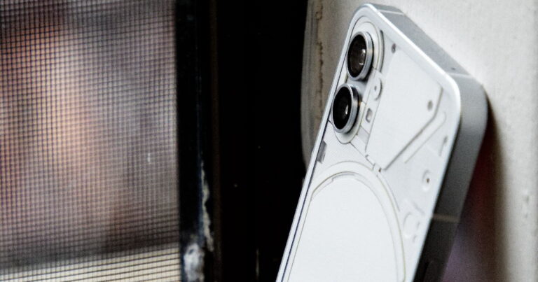
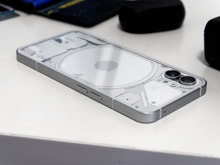
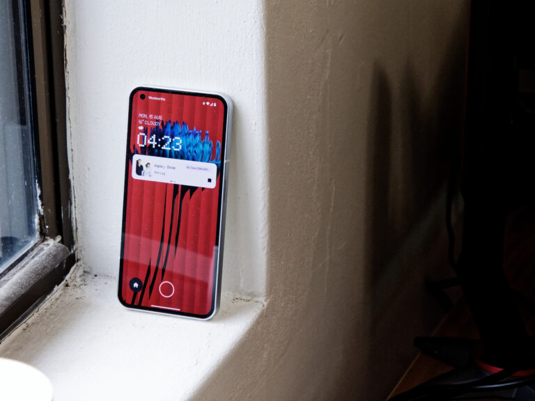
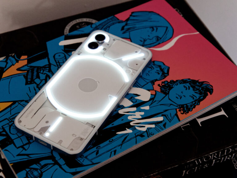
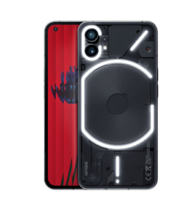
The Nothing Phone 1 arrives in two colours: white or black. However, the white model is only available in 256GB configurations. When ordering, you can also add on accessories like the Nothing Ear 1 wireless earbuds. Check out the table below for a round-up of how local retailers compare when it comes to pricing for the Nothing Phone 1 in Australia. Given that OnePlus never made it into the catalogues of carriers in Australia either, that shouldn’t be a huge surprise. Still, if you’re looking for a plan to go with your Phone 1, here’s a quick round-up of the most popular SIM-only plans with at least 20GB: Nothing’s first Android device is billed and built around a 6.55-inch OLED display with a 120Hz adaptive refresh rate and support for HDR10+ colour. This display comes backed up by Gorilla Glass 5 protection, which can also be found on the back of the device. Techies with a more discerning eye will likely be able to spot the difference between the FHD panel here and the QHD displays found amongst this year’s crop of flagship devices. Everyone else though? They’ll probably have a good time gazing at the glitzy screen found on the Phone 1. Other features that potential Phone 1 proselytes will want to know about include an in-display fingerprint sensor, dual stereo speakers and IP53 water and dust resistance. Again, what’s here is as comprehensive as something more premium, but more than respectable given the price involved. It’s not impossible to find something with a bigger or higher resolution screen than the one on the Nothing Phone 1, but it’ll probably cost you. What’s more, you’ll miss out on the best and most attractive part of the package here: the design. While the front of the Nothing Phone 1 doesn’t stray far from the average Android device, the back of the phone boasts a more distinct visual character that cuts through the competition. Rather than settle for the status quo seen across the mid-range market, the Phone 1 skews towards something else entirely with a semi-transparent design that’s reminiscent of an old-school iMac. Your mileage with the Phone 1’s unique looks may vary, but the fact that the device looks like nothing else out there (no pun intended) did wonders for how I felt about its various strengths and weaknesses. When modern mid-range Android smartphones are as homogeneous as they are, a little bit of different can go a long way. I sometimes wished the Phone 1 was a smidge smaller, but otherwise there’s little to fault in the material design. Lit up by a set of programmable lights called the Glyph Interface, the back of the Phone 1 can be customised with unique patterns for calls, notifications and more. Although entirely optional (and inevitably a little niche and/or unnecessary), this feature enhances the experience of using Nothing’s debut device in a number of small ways that feel more meaningful than they probably are. For instance, the Phone 1 isn’t the only Android device to automatically enter do-not-disturb when you place it face down on a surface. However, the addition of the Glyph Interface into this practice provides an additional degree of visual feedback not found elsewhere. Unfortunately, this specific example does highlight one of the Phone 1’s few weaknesses. By incentivizing me to place the device face-down more often through the above feedback loop, the screen on the device quickly became a magnet for small scratches and scrapes. So far, most of these abrasions have been absorbed by the screen protector. However, it’s a helpful reminder of the downside that comes with a smartphone that’s so contingent on design for its appeal. Even if the Phone 1 looks different and feels sturdy of the box, general wear and tear will start chipping away at the aesthetics sooner rather than later. As the condition of my Phone 1 degrades, I wouldn’t be surprised if the enthusiasm attached to it suffers from a similar decline.
Displaying battery life while the device is chargingActing as a visual indicator for when the Google Assistant has been triggered and is actively listening to youDisplaying unique lighting ringtones for notifications or incoming phone calls
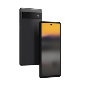
The back of the Nothing Phone 1 houses the device’s dual-lens main camera. The primary lens on the device boasts a 50MP Sony IMX766 sensor (also found in the recent ROG Phone 6) and an f/1.8 aperture. It comes flanked by a second 50MP Samsung JN1 sensor with an aperture of f/2.2. There’s also a 16MP camera (powered by a Sony IMX471 sensor and nestled inside a hole-punch notch) for selfies. While the lack of a telephoto lens does limit the level of optical zoom offered by the Nothing Phone 1, all the usual camera boxes you’d expect from a modern smartphone camera are ticked here. This list here includes stuff like portrait mode, night mode, scene detection, HDR and both 4K and 120FPS slow-motion video capture. Unfortunately, the one thing that the Phone 1 doesn’t cover off is arguably the most important. These days, the common thread connecting the best smartphone cameras is the use of software to enhance everyday results. It’s a little overly simplistic to frame algorithms as a secret sauce for what makes the cameras on the latest iPhone and Google Pixel devices as good as they are, but it’s not far off either. Apple and Google are throwing legions of software engineers at the problem of making their cameras work smarter rather than hardware, and Nothing’s best simply reflects the difference in resources at its disposal. It would be generous to say that the Phone 1 massively outperforms most other Android mid-rangers of this class. The results you can expect out of the hardware here are nice, but rarely astounding in their fidelity, detail and colour. If you care more about the looks of the Nothing Phone 1 than the photos you’re going to take with the camera on it, you’ll probably be able to get by. However, Those who do want a budget-friendly price-point and better smartphone photography are likely going to be better served by the Pixel 6a. In any case, check out the gallery below for a round-up of image samples for a glimpse of how the rear camera on the Nothing Phone 1 fared in action. Nothing’s first smartphone comes powered by a Qualcomm Snapdragon 778G+, up to 12GB of RAM, up to 256GB of storage, and a 4500mAh battery. That’s not too far from the average Android device at this price point, even if does come spliced and spiced by the inclusion of Nothing’s nifty launcher. I downloaded the beta version of Nothing’s Android skin to trial on my Galaxy Z Flip3 several months back, so the software experience offered by the Phone 1 wasn’t a huge adjustment on my part. If you’re considering jumping on board with the Phone 1, I strongly recommend doing the same. Nothing’s take on Android mostly sticks to what’s actually useful, but takes the time to accentuate those wins with an appropriate level of flair and flourish. What’s here is pretty light on bloatware, but big on style and aesthetics. The hardware powering all this embodies a similar set of values. The Snapdragon silicon inside the Phone 1 can’t outpace Apple’s A15 Bionic, but it’s more than up to the task of keeping Android feeling snappy and responsive. Apps loaded fast, and the 120Hz display proved itself a pixel-perfect canvas for mobile gaming experiences like League of Legends: Wild Rift, Marvel Snap, Diablo Immortal and Call of Duty: Mobile. If you’re the kind of performance-oriented user, the hardware here is no substitute for the high-performance chipsets found in the iPhone 13 and Galaxy S22. Still, when it comes to the daily realities of what I demand from my smartphone, there’s not much that the Nothing Phone 1 couldn’t handle. At the time of writing, Nothing is promising three years of Android software updates for the device and 4 years of bi-monthly security patches. This is decent, though a step below what even Samsung offers nowadays. Still, it will be intriguing to see if these updates include new Glyph-related functions or anything as ambitious as Google’s Pixel Feature Drops. Unlike Samsung or OPPO, Nothing’s track record when it comes to post-launch software support is a blank slate. It’s possible that the startup’s smaller size may prove to be its undoing. Then again, the Phone 1 is pretty much as far from a mainstream Android device as you can get these days and Nothing’s short-term survival and long-term success rely on keeping its relatively small pool of customers happy. Once I had the device fully set up and tinkering with the settings, I’d regularly make it through a full day with around 40% charge remaining. That’s not quite enough that I’d be willing to two days between charges, but it was good enough that I rarely felt any sort of anxiety around the Phone 1 when I was out and about. The Phone 1’s long battery life is further sweetened by the inclusion of both 30W fast-charging and 15W wireless charging, the latter of which remains a rarity in phones of this particular price segment. When it comes to battery life, the Nothing Phone 1 strikes a confident and compelling balance even if it falls short of category leaders. It’s striking and refreshing to see something this new and different in the conversation, but the Nothing Phone 1 delivers more of a sideswipe than a sucker punch to the mid-range market. Those looking for an affordable but compelling Android device may find it hard to pick the Phone 1 over the Pixel 6a, which offers up a better processor and camera for a $100 less. As far as putting Carl Pei’s startup on the map goes, the Nothing Phone 1 is hard to fault. The debut device pairs up solid specs and a distinguished design to excellent effect. It’s not quite compelling enough to be the final word, but it’s a slick conversation starter nevertheless.
